Client | Critical Mass
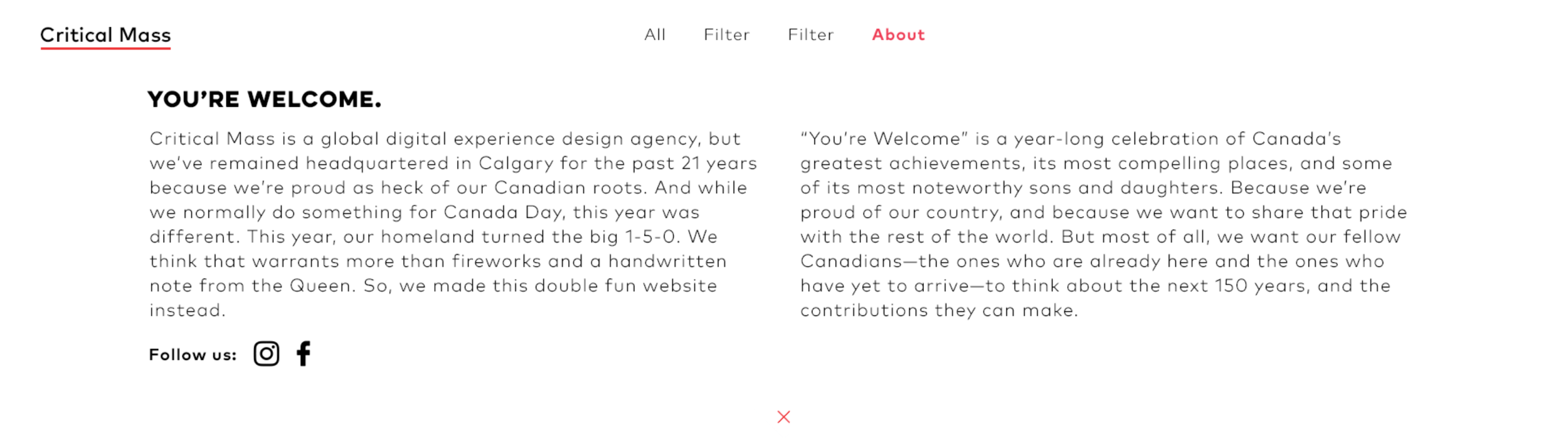
You’re Welcome
Team
Dylan Bobier | Designer
David Hong | Supervising Art Director
Alice Petrova | UX Architect
Sabrina Alaimo | Supervising Sr. UX Architect
Sylvia Benn | Copy Writer
Steven Kiser | Supervising Sr. Copywriter
Cecily Lo | Producer
Deepak Mehmi | Creative Director
The Ask
Critical Mass is the oldest Canadian digital agency, to honour our heritage during the Canada 150 festival, create a digital first idea that celebrates Canada’s history while also promoting Critical Mass as a premiere Canadian agency.
The Insight
Canada is a young country known for nice, polite and generally accepting folks. But many of these people aren’t aware of our nation’s amazing accomplishments.
The Idea
Celebrate Canada’s birthday month and year by showing the amazing things that have come from Canada, in a way only a truly Canadian company can, with a humble brag. We are saying ‘You’re Welcome’ to Canadians and the world for all that Canada has offered and will continue to offer a global community

Look & Feel
We wanted to create a look and feel that still felt like an extension of the Critical Mass voice and brand identity, that meant choosing fonts and UI elements that were grounded in that identity. Our colour palette needed to be robust enough to accomodate almost any colour or tone, as the subjects of all the illustrations would vary.
Typography


Colours

B7001F – F2571C

1AA8F3 – 292E93

FFF70A – FA9406

ED008C – 631490

90CE35 – F2571C

FFFFFF

252525
Interface Design
The goal was to create a side scrolling experience that let users discover each content piece on one screen.
We created an expandable content modal so that the copy could be read while the illustration was still on screen, as oppose to a full screen modal takeover.
The dropdown menu reveals the full list of content pieces and mimics the side scroll of the side. Content is sorted into two different categories that you can filter through the menu. Language controls and about are both also contained within the dropdown.
We opted for an adaptive design as oppose to full responsive due to the horizontal nature of the microsite. And adaptive solution to a more vertical layout in both the content and the menu would give mobile users the best possible experience.