Client | Google
Project Cher
Team
Visual Design Lead – Dylan Bobier
UX Lead – Elise Ansher
Creative Director – Alex Safchuk
Group Creative Director – Tom Sears
The Brief
Google and YouTube approached our team with the task to develop the interface structure for an avatar building platform to be used across both brands, code named Project Cher (yes that is a Clueless reference).
Audience
Google's platform had a variety of use-cases for avatars, from Google Meet to the Android unboxing experience so our target audience was very broad.
YouTube
YouTube had a very specific use-case, to allow more people to create content while maintaining anonymity. This meant there were different priority features for each brand to focus on.
Phase One
Audit & Synthesis
Our team started by auditing the current avatar landscape doing a deep dive into the experiences of the following brands:
Meta
•
Bitmoji
•
The Sims
•
Roblox
•
Ready Player Me
•
Meta • Bitmoji • The Sims • Roblox • Ready Player Me •
Genies
•
Disney Dreamlight Valley
•
Zepeto
•
TikTok
•
Fortnite
•
Genies • Disney Dreamlight Valley • Zepeto • TikTok • Fortnite •
Samsung AR
•
Memoji
•
Replika
•
Cyberpunk 2077
•
DA Inquisition
•
Samsung AR • Memoji • Replika • Cyberpunk 2077 • DA Inquisition •
Our Findings
After auditing the current landscape and user testing select competitors with users we distilled the research and user interviews down to 5 main themes that would shape our experience.
-
Inclusivity is top of mind for most users, even if they are not a diverse minority themselves. A lot of the current market lacks true inclusivity when it comes to avatar customization. They appreciate seeing representation of all kinds (body type, skin colour, ability levels) and it makes them feel more likely to recommend a platform to friends.
Tools that extend to deep levels of customization, like custom pattern makers for outfits or environment controls help platforms stand out amongst the current crowd of avatar platforms.
-
Users look for easy-to-use and familiar UX patterns in customization experiences. Anything that feels intuitive to how you want to mold your digital self is important to keep the experience streamlined.
The more control over customization the better, while some users admitted they wouldn’t use a certain depth of control, they knew many friends who would and appreciated the inclusion.
As these experiences are meant to create a digital person, having it be static during the customization experience felt ‘uncanny valley-esque’, including haptic feedback or reactions from the avatar while you customize is key.
-
Hard gated onboarding is a blocker for a lot of users, they are looking for instructions and key information to be presented along their journey, not all at once.
Paywalls are almost always a no-no, while the test users were all digitally savvy and interested, many noted that too many avatar platforms want to charge for basic customization features.
-
Extended the avatar out of just the makeover platform and into other spaces would make the experience much more worthwhile for users. Some could spend hours customizing and want to have it live across the internet.
Many users are highly motivated by their social networks and admit that seeing friends, family and influencers using and sharing their avatars makes them want to create and keep them up-to-date.
-
A consistent flow of updated content is key to driving user engagement. If people see the ‘store’ gets updated consistently with new cosmetics they are more inclined to keep using it in case something new pops up that interests them.
The store is where many users were okay seeing paywalled content, particularly if it was a brand sponsorship that interested them (Nike, Adidas, Louis Vuitton, etc).
Phase Two
Concepting
Having analyzed our competition the team then started to concept improvements on existing features that were must haves or new features not yet on the market. This involved whiteboard sessions, sketching and ‘quick-and-dirty’ wireframing and lite designs.
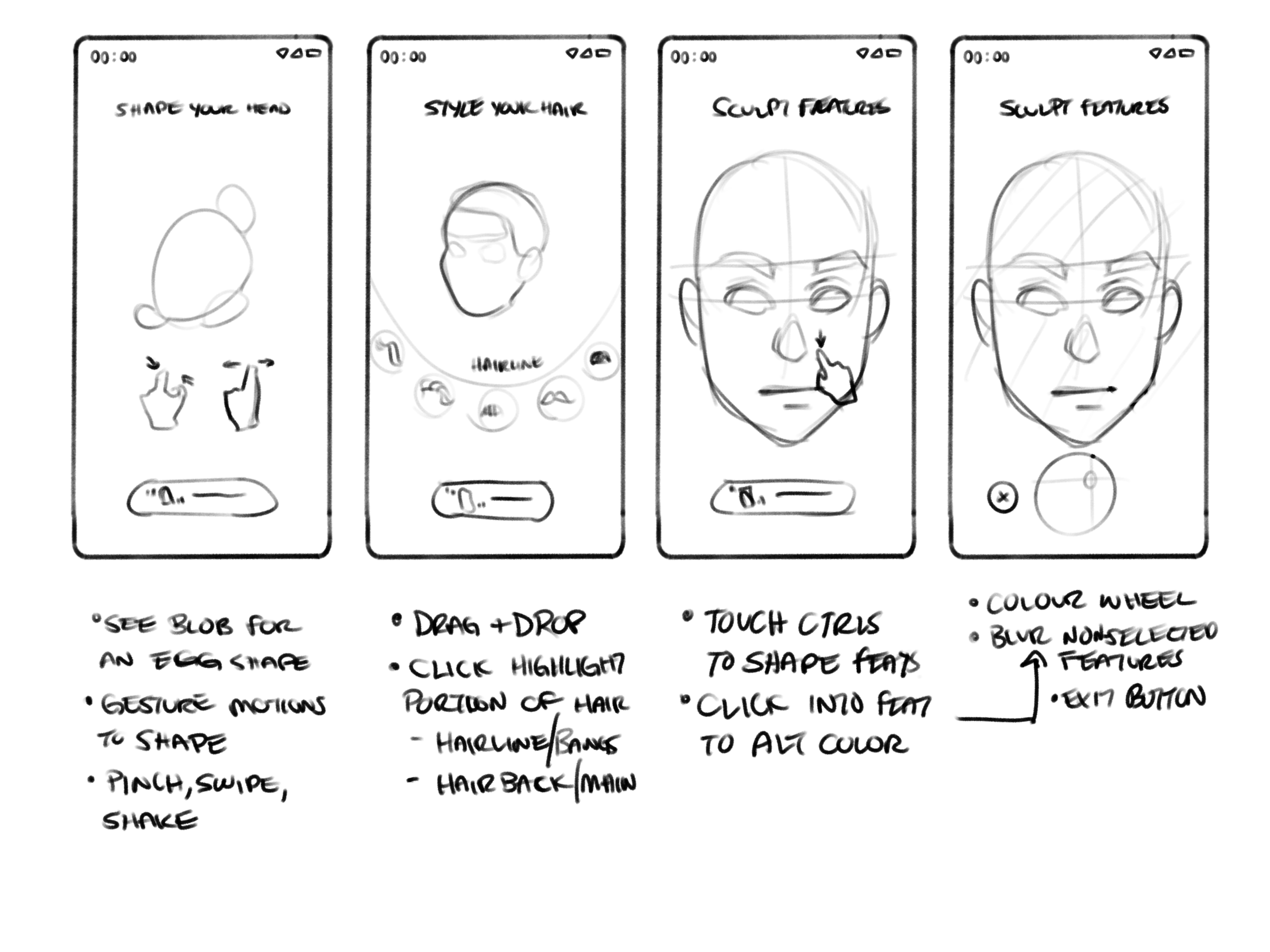
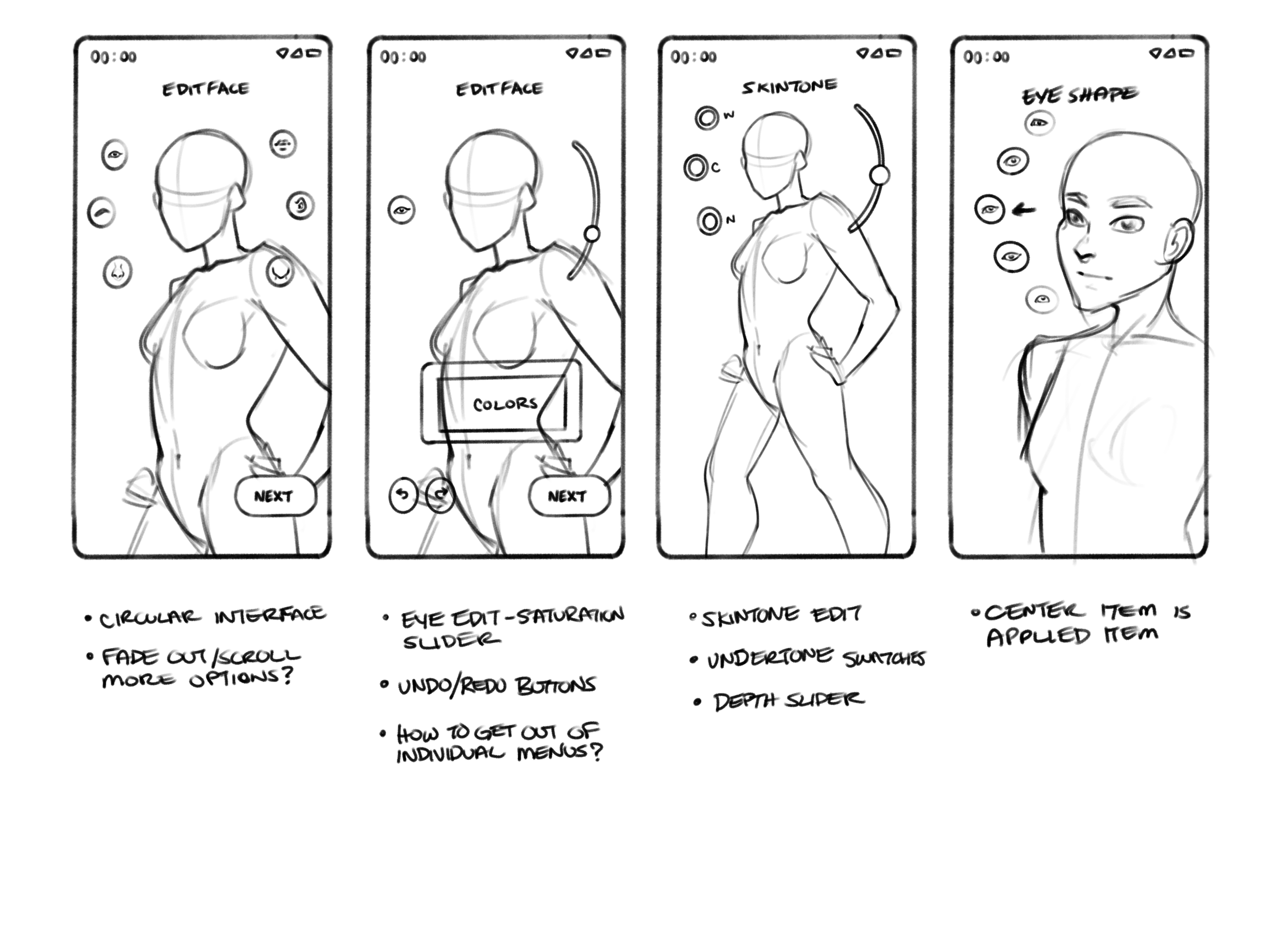
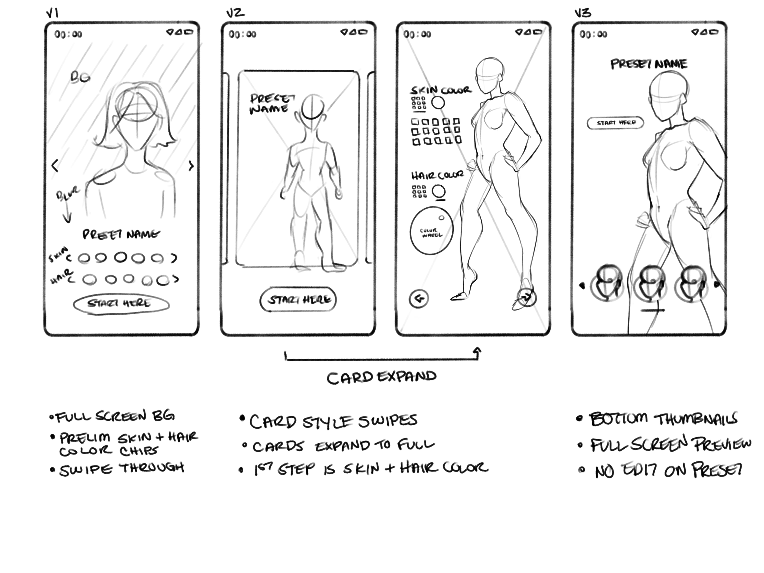
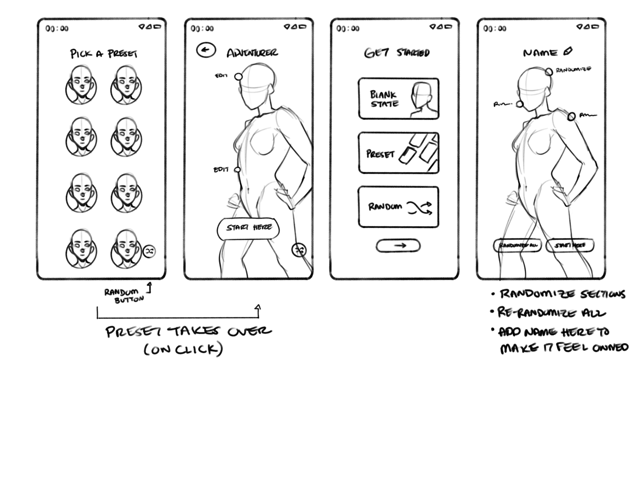
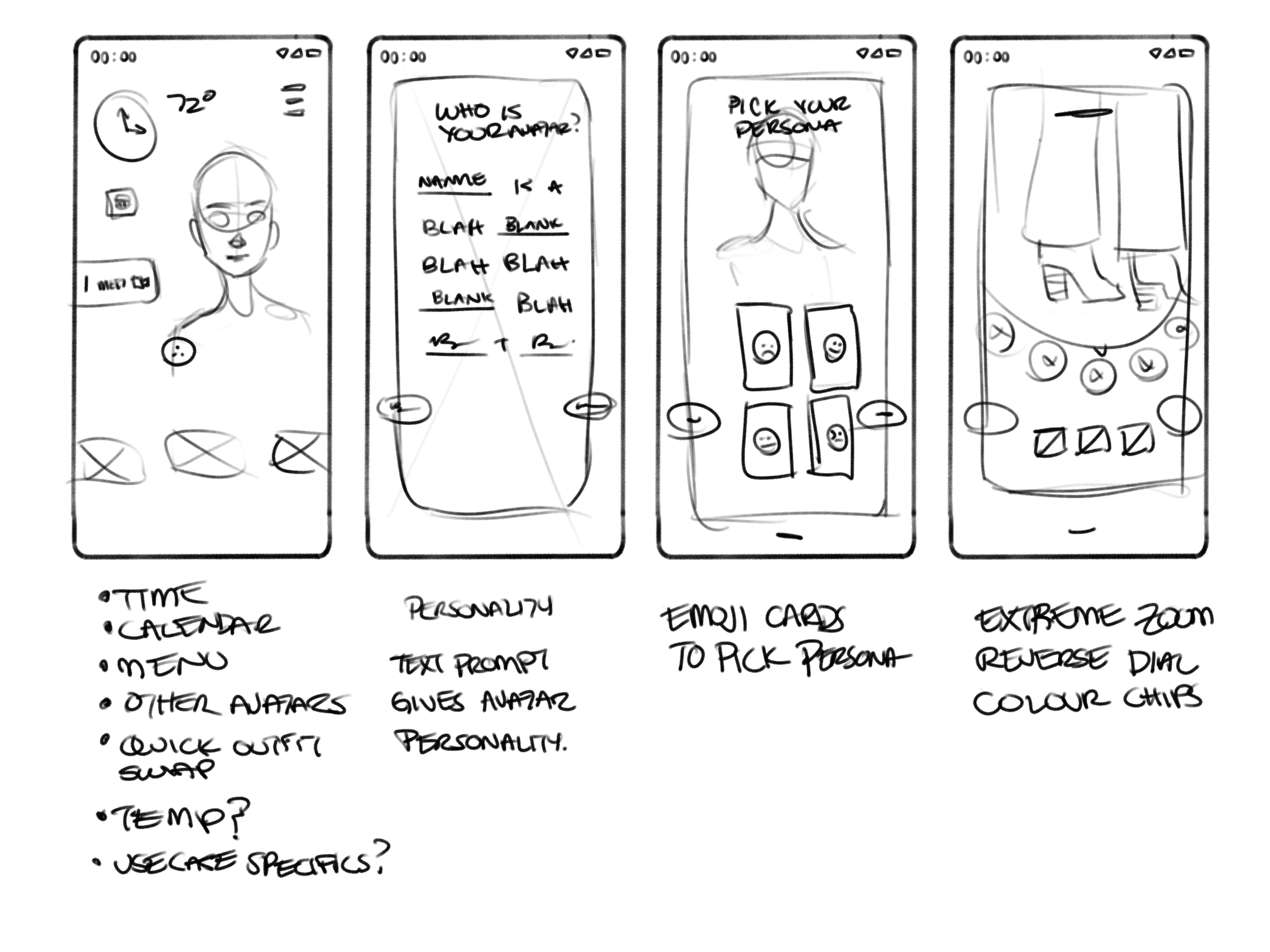
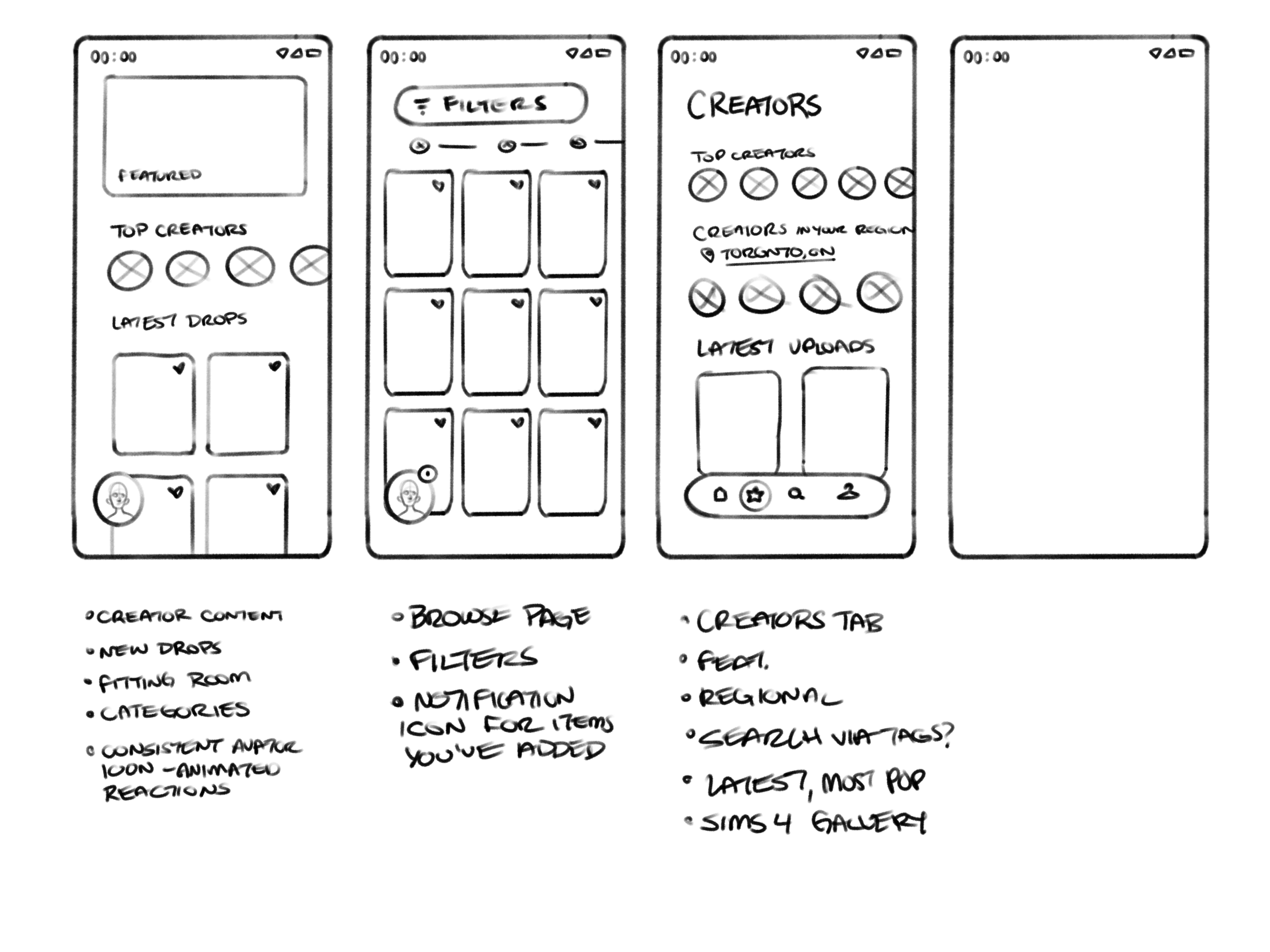
Design Explorations
After brainstorming key features to include in the experience, taking in client feedback we had to synthesize all of those into a consistent user flow. At this point we began experimenting with different visual design look & feels, some closer to what Google and YouTube currently have and some that pushed the aesthetics further for a much younger audience. The term 'Japanese minimalism’ was tossed around by the client a lot in these phases. (It didn’t really apply to the final version in the end)
Resonance Testing
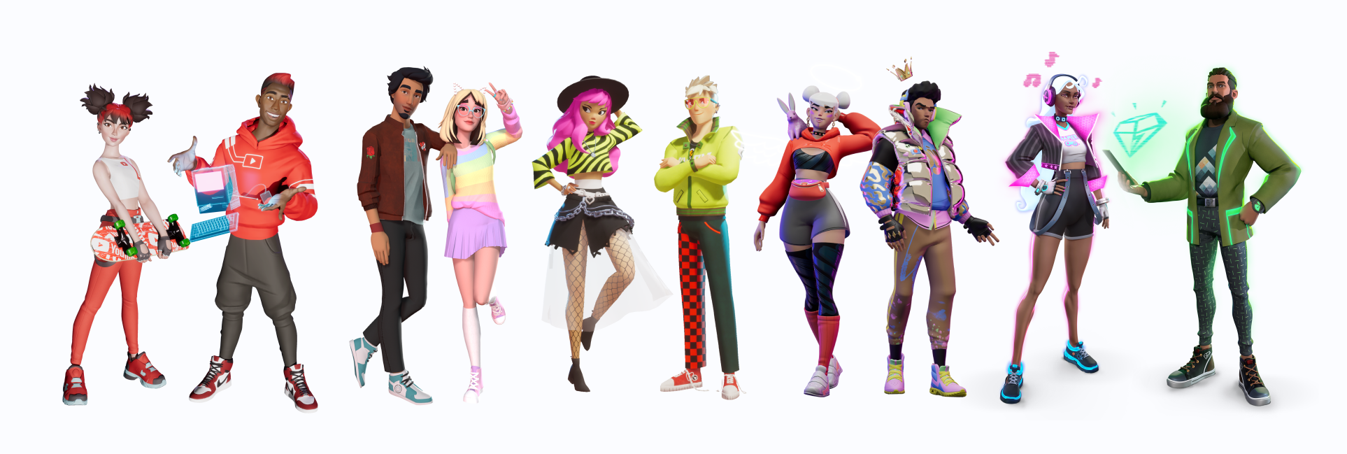
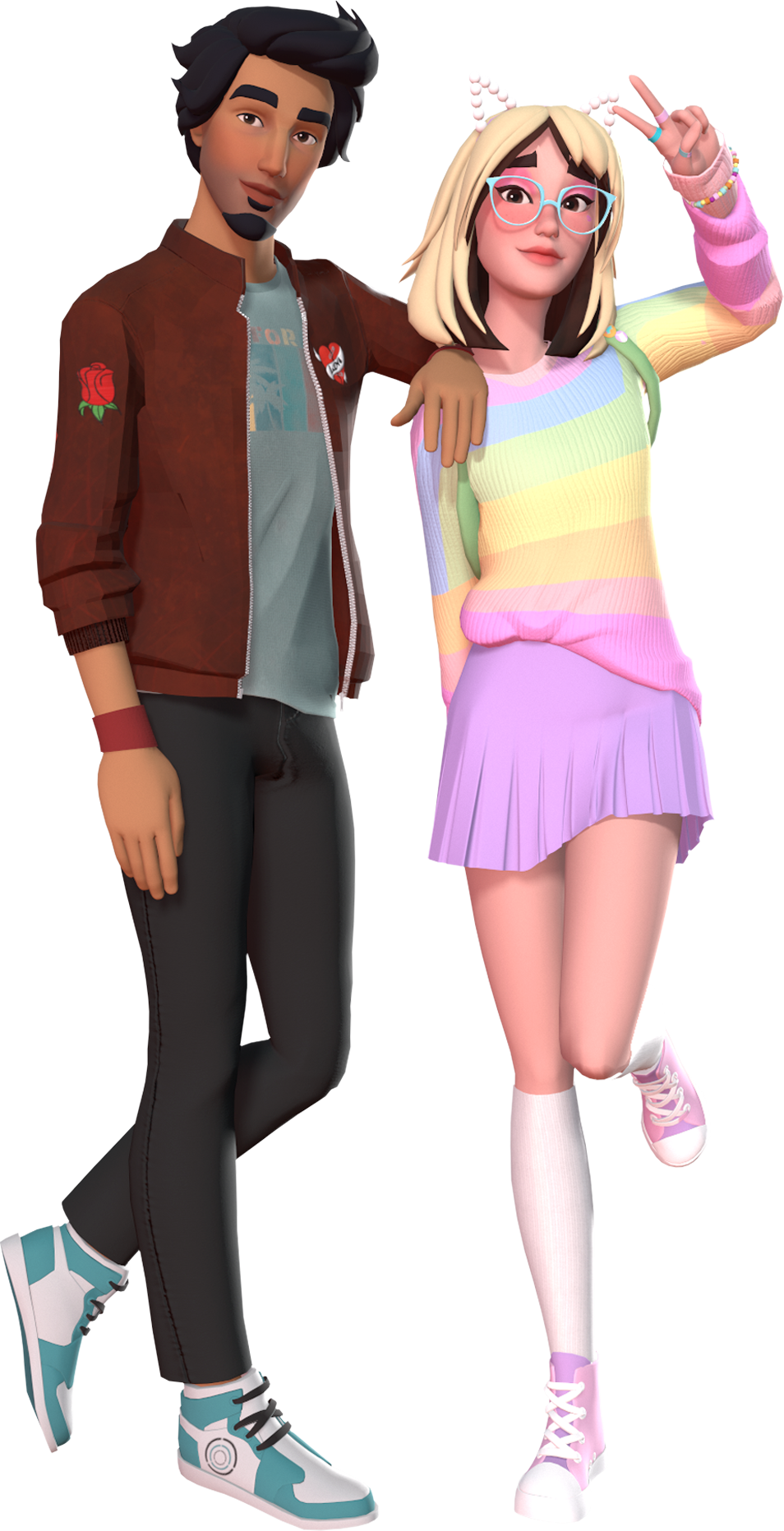
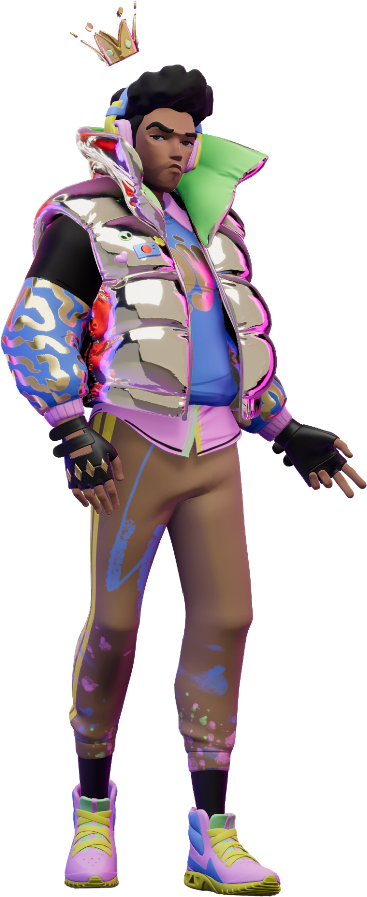
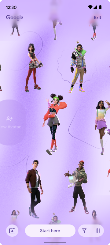
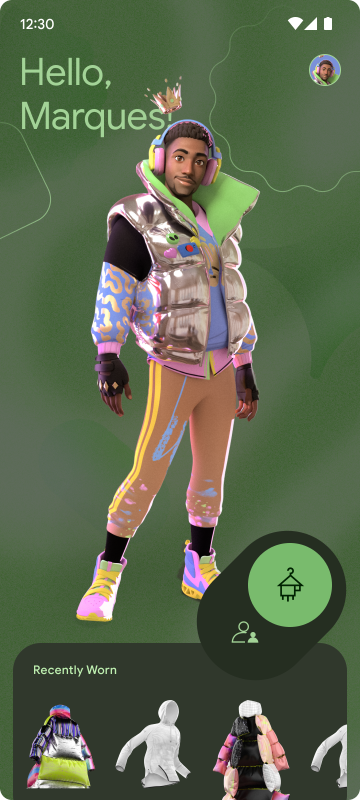
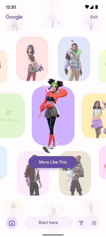
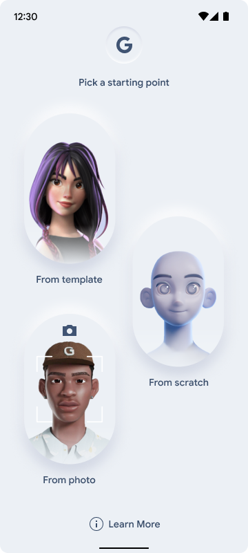
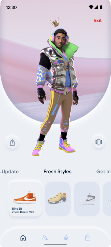
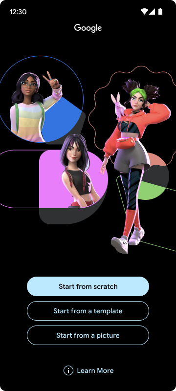
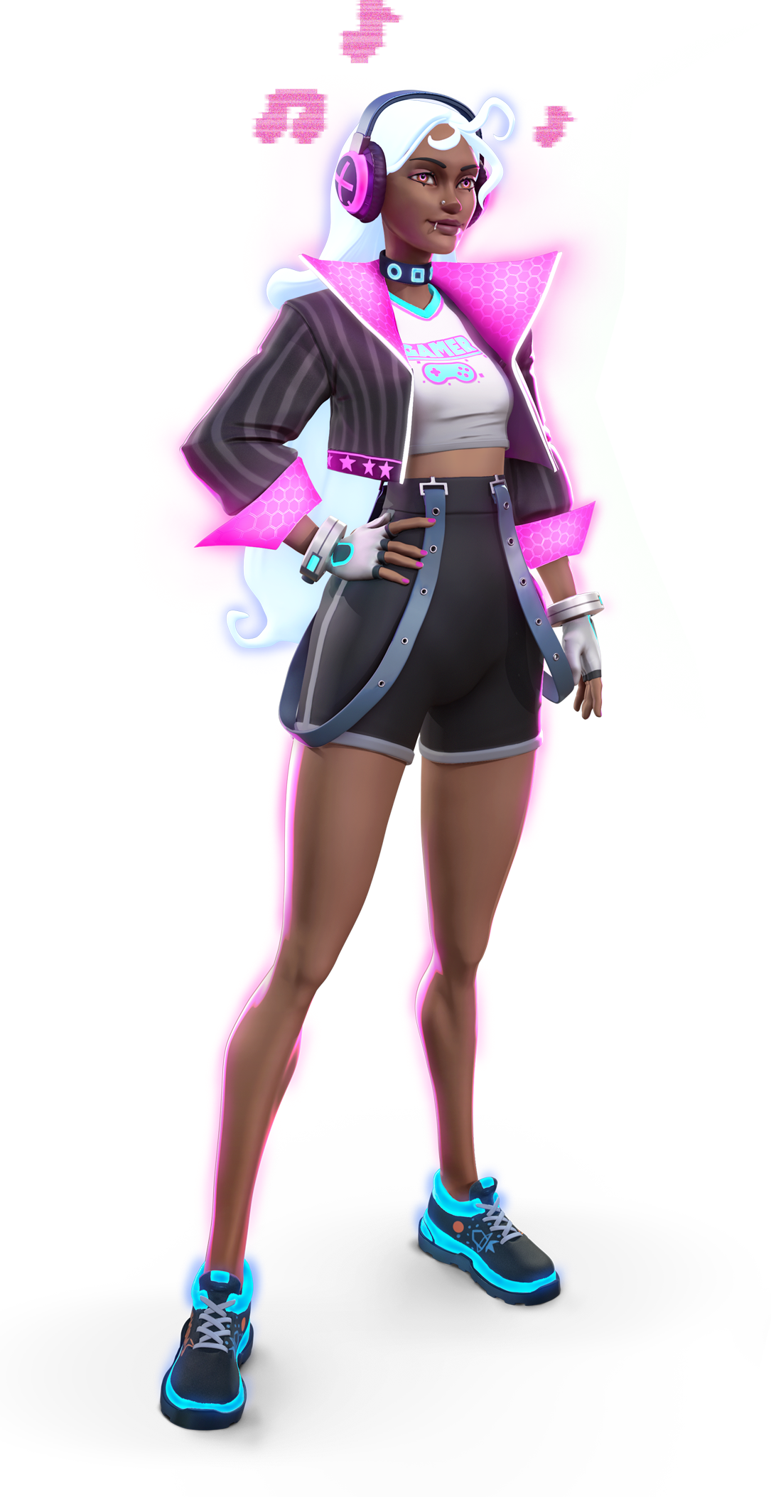
At the end of this phase we performed concept resonance testing with multiple users over a weeks period, to see which features tested the best and should be brought into MVP and if there were any gaps we had missed in concepting. A quick snapshot at the depth of realism we tried to achieve with the testing prototype, completed in less than a week.
User Quotes
“There isn’t an already made girl or boy to influence me.”
— User Interview One
“The setup is easy to navigate and more accessible than other apps.”
— User Interview Two
“This is cool, a fun way to present them, not just the regular tiles.”
— User Interview Three
“Obviously I didn’t think about this, but this makes a lot more sense, there are people who are disabled.”
— User Interview Six
“It subcategories all the parts of the body so I can customize what I want, so that’s good."
— User Interview Seven
“I think this definitely takes a lot of stress off of people who are indecisive.”
— User Interview Nine
Phase Three
Production
As we moved into the final phase we had to break the experience down to a simple MVP for both brands. In the end Google decided to hold their test version until YouTube had launched as a trial run of the product.
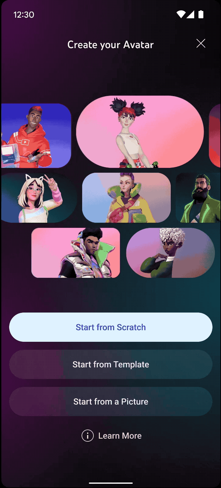
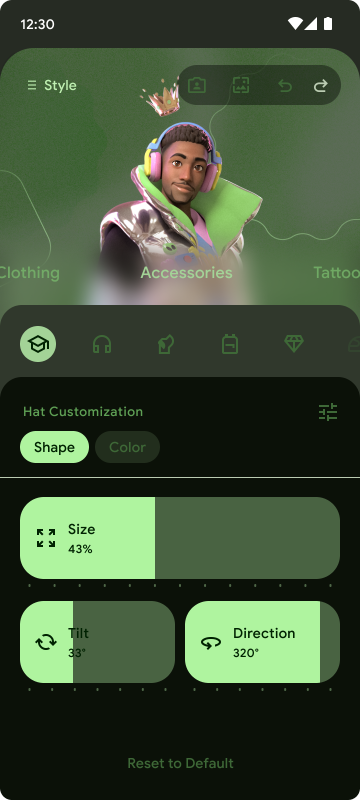
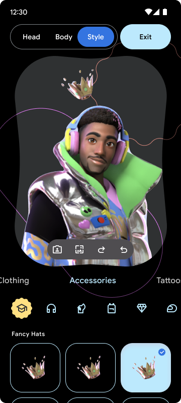
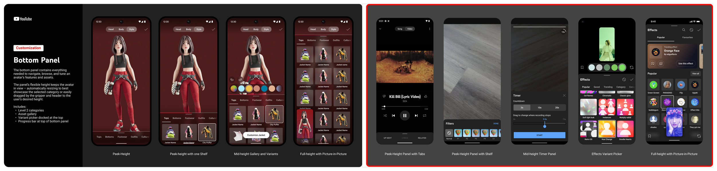
The process was split into four 2-week-sprints where myself and our UXL built out feature based prototypes each sprint, that were tested with user participants. Any feedback from these rounds of testing was addressed in our final sprint where we delivered dev ready redline files and prototypes to the YouTube team, you can see a small glimpse of that work below.
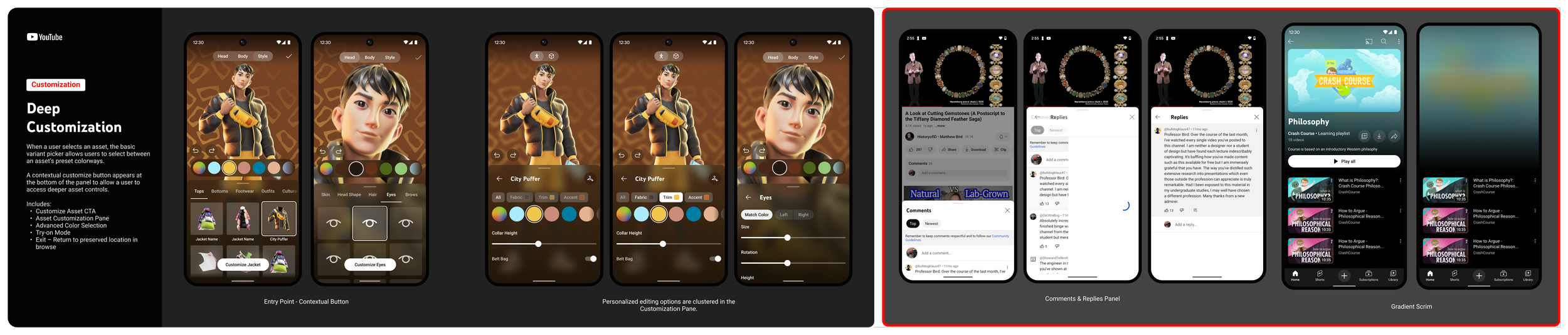
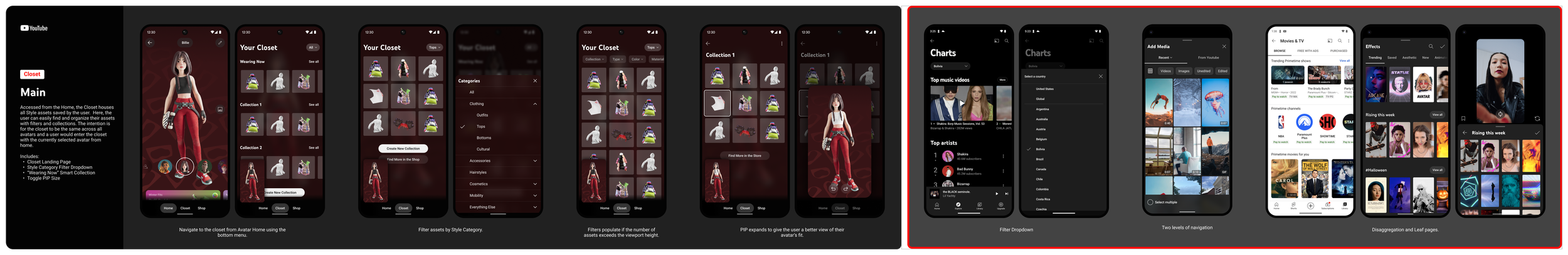
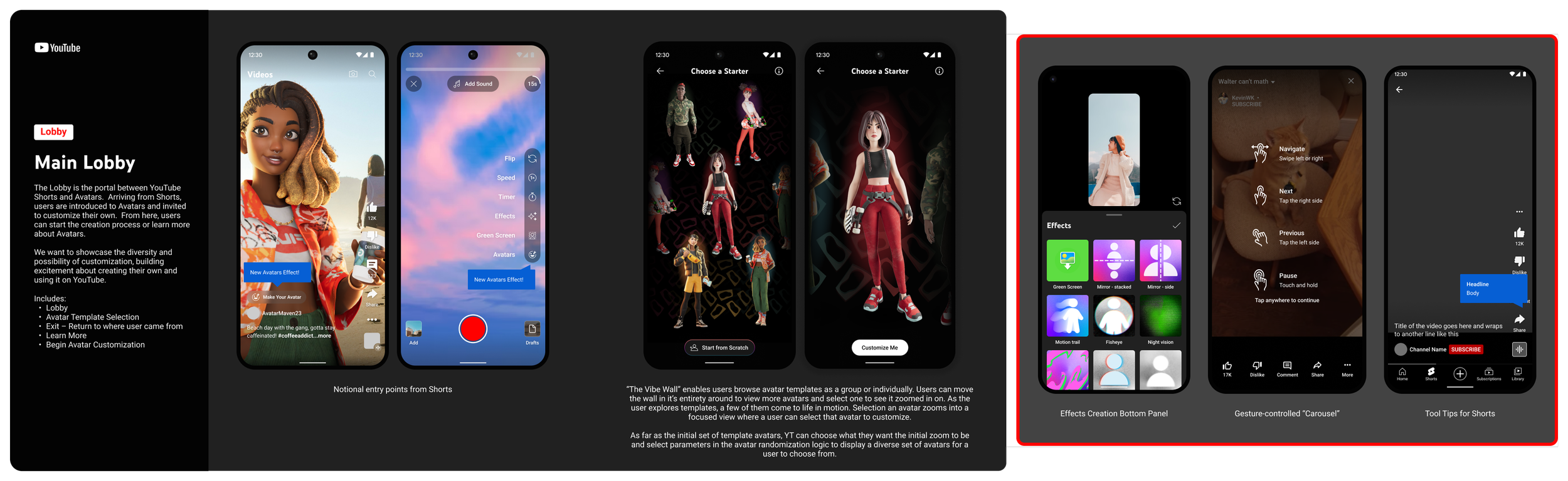
While we did not get to ship every feature and new design pattern the team had hoped for due to budget cuts and time constraints, in the end our team delivered a tight MVP to YouTube for them to test within their creator partner network.